Logos
Sometimes, all that you need may be a logo.
An opportunity to make a good first impression. A way to take your business idea off the page and into the world. Or simply a way to bring your business back up to date.
A good logo can capture the values you want to emphasise. It can keep you relevant when things change. It can kick start a campaign. It can breathe new life into an existing business. It can take an old idea and make it into something exciting for a new audience. But it’s important to remember that this is still a strategic decision.
And an investment.
Because it’s going to be the foundation of your future.
Quiptel
Video streaming start-up Quiptel needed an identity to help launch their intelligent routing platform to potential partners and investors. The identity uses two proportionate circles to create a letter Q and also picks up on the idea that this new software intelligently delivers high quality video across challenging mobile and broadband networks to multiple devices by reducing the network capacity required by up to 80%.
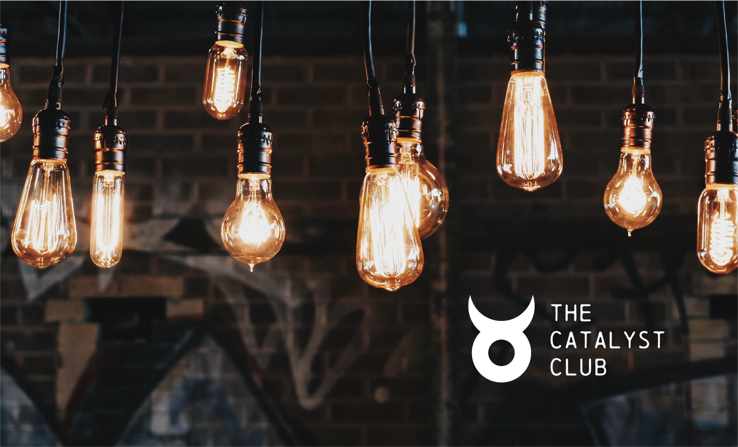
The Catalyst Club
A slightly rebellious identity with a twist on the alchemist’s symbol for platinum - one of the strongest catalytic elements - for a creative agency’s regular after work meet-ups, where guest speakers present thought-provoking topics in a basement environment with just a touch of the speak-easy vibe.
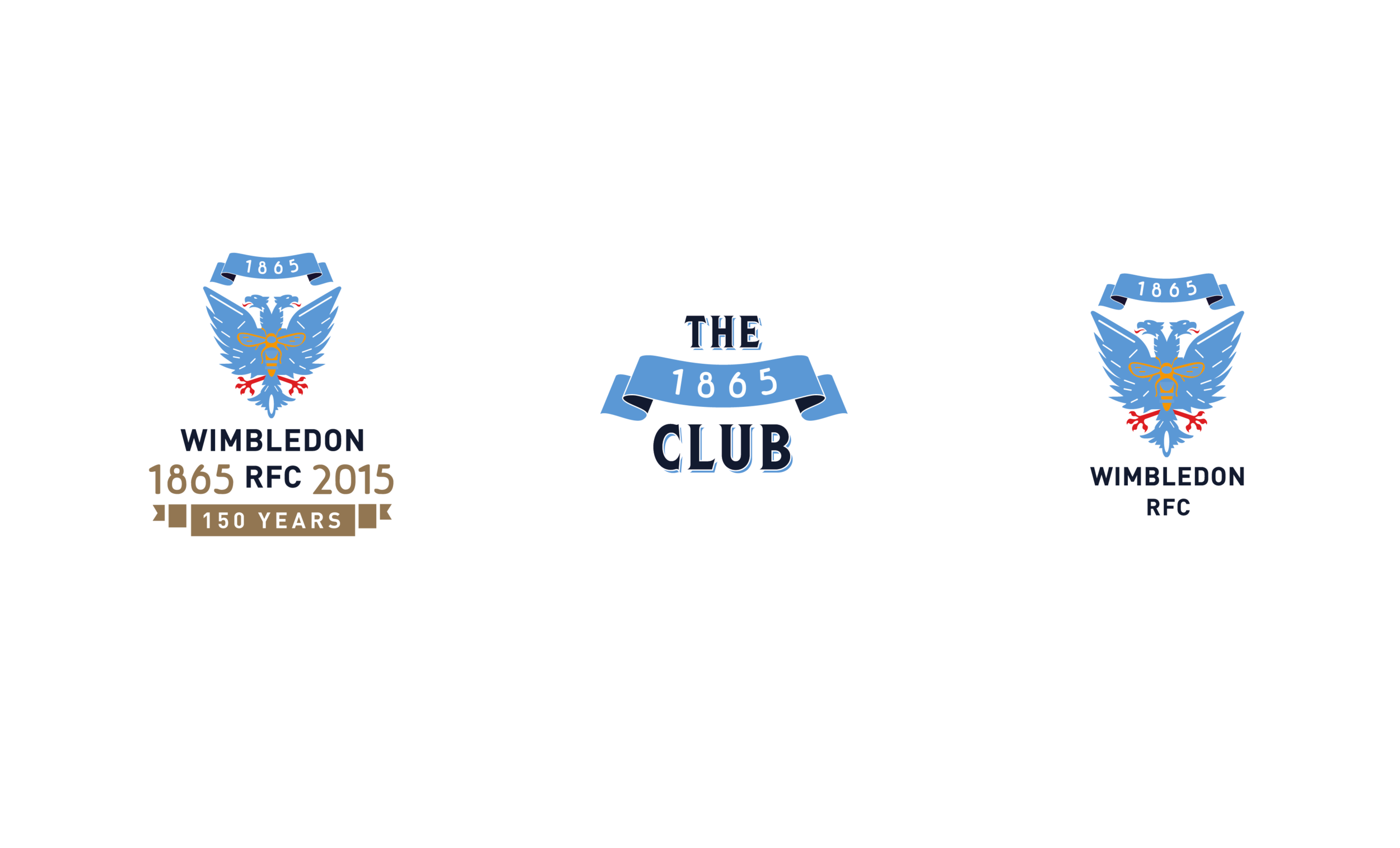
Wimbledon RFC
Founded in 1865, Wimbledon RFC are one of the oldest rugby clubs in the country and were a founding member of the RFU.
To mark the occasion of their 150th anniversary, we created a new logo which also involved redrawing the original double-headed eagle, giving the emblem more clarity, and creating a badge that could now be reproduced consistently across a range of merchandise and digital applications.
We also extended the designs to help launch a new Members Social Club and an updated crest for all teamwear.

Manulife i-customer initiative
Manulife were looking to engage their people in the importance of outstanding client service – and the role they played in delivering it.
We developed a strong and instantly recognisable symbol, a combination of the letters i and c, which maintained the all impportant human dimension without being at odds with the Manulife corporate brand.

Dairy Co / AHDB
We developed an endorsement logo to support an industry initiative to help dairy farmers, food producers and other stakeholders communicate and promote the health benefits of milk within all dairy products.
Changing Faces 25th Anniversary
Changing Faces is the national charity that helps people with facial and body disfigurements and they needed an identity to aid the transition from a founder-led organisation to a brand-led one.
Our solution of a butterfly captures the qualities of endurance, change, hope, and life but with one significant difference.
The bright geometric and asymmetrical design is deliberately at odds with a butterfly’s natural patterns and reflects the diverse and asymetric community the charity represents and formed part of a bold brand system.
To celebrate the charity’s 25th anniversary, we adapted the logo to announce the achievement and still work across all print and digital channels.
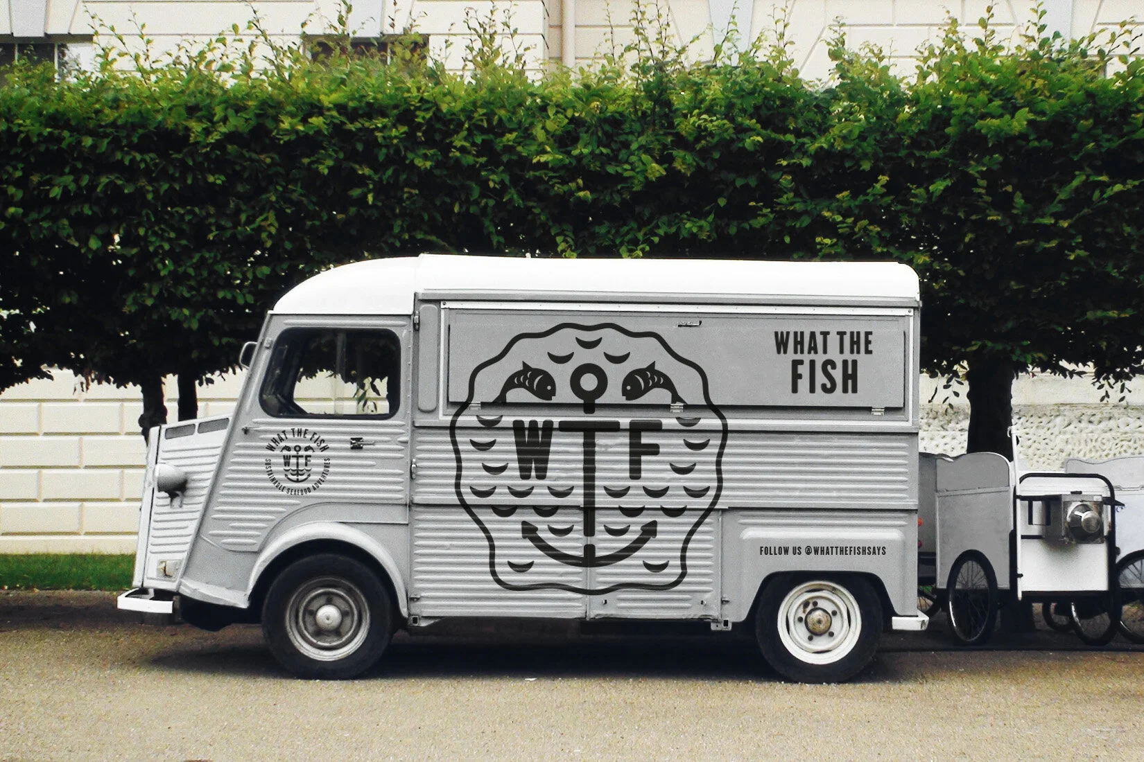
What the Fish
A new street food business needed a name and identity to make a big splash at local food markets that would attract customers as well as gain interest from local press and event organisers. In a highly competitive market, they needed something memorable, recognisable and with a bit of an attitude that spoke to their idea of using sustainable British fish with amazing flavour combinations and recipes from around the world.
A R C
An identity for a start-up specialising in residential and commercial floor plans, photography and EPC certificates supplied via an online platform to small and medium sized estate agents.
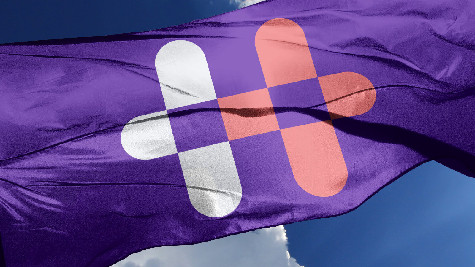
Health Partners
A new identity for an occupational health company that combines two crosses to represent the clinical side of the business and the idea of people, progress and partnerships. The new symbol is also the letter H,from the new name, giving them a unique and ownable icon. helping set them apart in a world where cold corporate blues, greens and health clichés tend to dominate.
Zion Sport
A new identity for this up and coming sports development and clothing company founded by two former professional rugby players. The logo captures the movent, dynamism and strength of sport as well as a uniquely identifiable symbol for use on clothing, accessories and products.
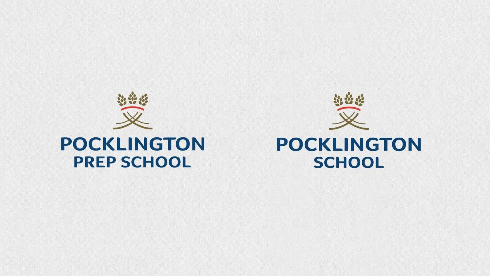
Pocklington School
Founded in 1514, Pocklington is an independent school in Yorkshire and one of the oldest in the country. As part of their growth strategy we developed a new identity to help broaden their appeal to a new cohort of families.
We took the wheatsheaf from the school’s coat of arms and gave it a modern twist. Traditionally, an heraldic wheatsheaf symbolises that ‘the harvest of one’s hopes has been secured’, an appropriate metaphor for education and the school’s ethos.
Mind Foundry
At the centre of the identity for this artificial intelligence company from the University of Oxford, is a Bayesian graph, a useful tool in applied machine learning that provides a way of thinking about the relationship between data and potential models. Tweaking the original graphs to strengthen its ability to clearly reflect the letter M, our solution helps take Mind Foundry beyond being seen as an academic spin off and helps position them as a relevant and commercially savvy organisation.