
Tots to Travel
Brand strategy
Proposition development
Logo
Visual identity system
Creative direction
Design for print
Brand architecture and management
Digital and Direct marketing
Website
Content development
Challenge
Tots to Travel is a fast growing, disruptive and innovative niche travel business that specialises in holidays for families with one or more children under the age of five.
For many parents, a holiday with babies and small children is a very different proposition to the one they were used to before having a family. Their priorities may have changed, but expectations rightly remain the same. Yet their choice does not.
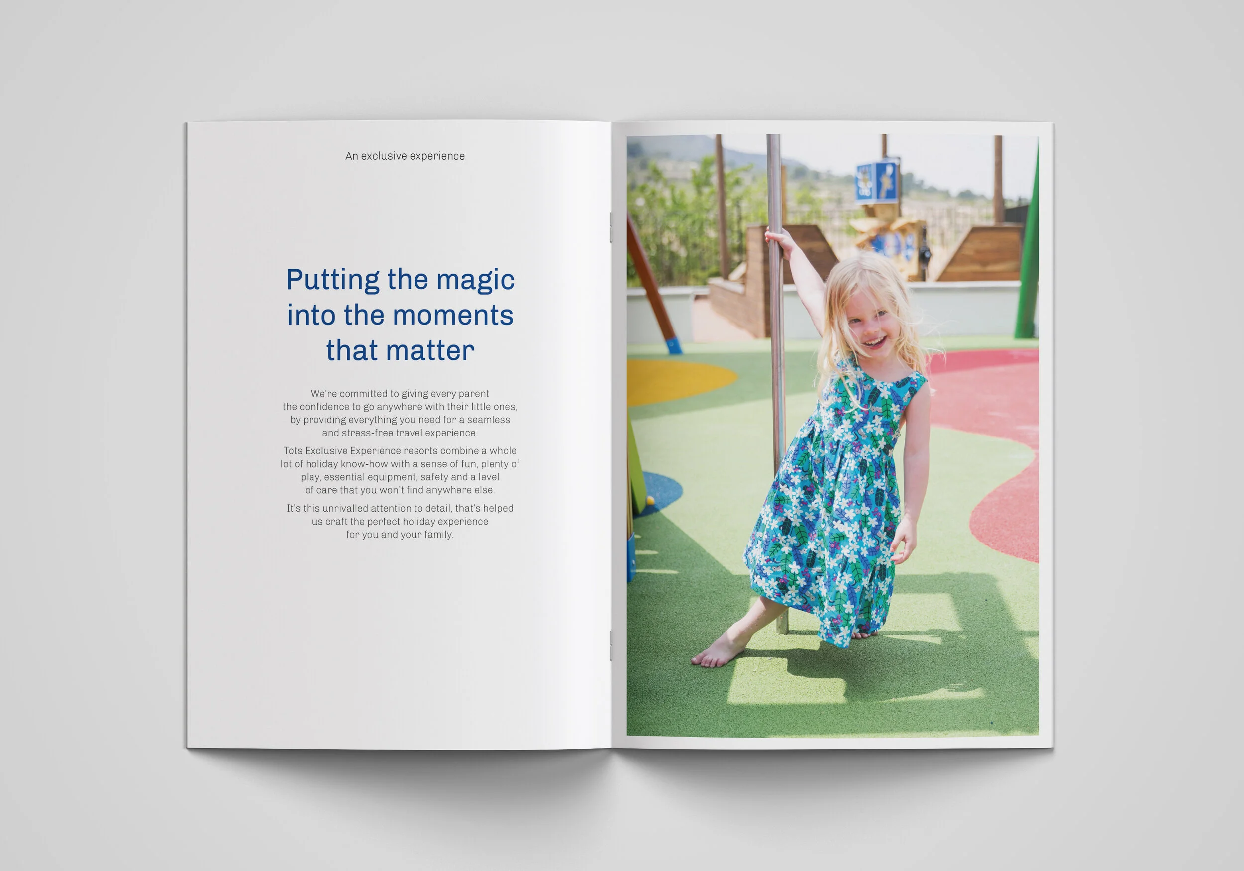
Our challenge was to develop a brand strategy and visual identity to support the businesses ambitious growth plans and transition from holiday rentals into a bespoke resort company. Having launched their first test resort under the Tots Love Fun banner, there was an opportunity to re-evaluate the whole Tots offer and architecture to reimagine what family holidays could be.
We needed to build a brand that represented fun, embraced the rhythm of family life and the specific needs of parents with young children to create clear space between Tots and the mainstream tour operators.
Solution
With online booking, servicing and the use of social media growing in importance, we designed a new digital-first logo, crafting a symbol that was a literal interpretation of the name projecting a sense of professionalism, quality as well as a little bit of fun.
A new visual identity was developed using a series of abstract ‘land-shapes’ that, through their colour combinations, reflect different regional landscapes and types of holiday: coastal, countryside and ski. We also designed a series of icons for different types of holiday activities, adding another layer to the story.


We also worked closely with the product team to develop the resort offer and overall guest experience, writing a new brand narrative, compelling Tots ‘to widen the world’ for parents with children under five. An idea that allows Tots to talk to families about giving them the confidence to experience new places and enjoy them, entirely on their terms.
This was underpinned by a new positioning that drew on their exceptional attention to every detail. ‘The most attentive holiday firm on the planet’ reinforces their ethos of providing the finest hand-picked villas and resorts with everything parents and their little ones need to feel at home, away from home.
And alongside the digital team we helped them overhaul the website and social media accounts to better reflect the redefined offer and boost the Tots Resort presence.


We commissioned the wonderful Sally Payne to develop three sets of animal characters, holiday objects and patterns for each type of destination which became art prints, cushions and textiles as well as wall stickers in the apartments.
We designed new guest packs including colouring books, resort maps, door hangers and essential info. The rooms were transformed with designated play corners and the children’s bedrooms came to life with the new illustrations.
Outside, we’ve designed new resort signage, menus and clothing to create more ownership around the resort.


