The Access Project
Qualitative research
Stakeholder management
Brand strategy
Logo
Visual identity system
Content development
Challenge
The Access Project is a UK education charity providing in-school mentoring and 1-2-1 tuition for talented young people from disadvantaged backgrounds gain access to an education at one of the UK’s top universities.
To help with their expansion we were asked to develop a brand and identity that would enable them to better tell their amazing story, increase their visibility within schools and to partners as well as address the different attitudes, motivations and logistical challenges found in the different regions.
Our challenge was to ensure that this wouldn’t become a crusade against an imperfect system but rather to show how The Access Project was working within it to help those students with the talent and motivation fulfil their potential.
Solution
We defined two important brand themes: the need to bring to life the possibilities stemming from the offer and emphasising the support through the journey for students and volunteer tutors. These also became the foundation for the new identity.
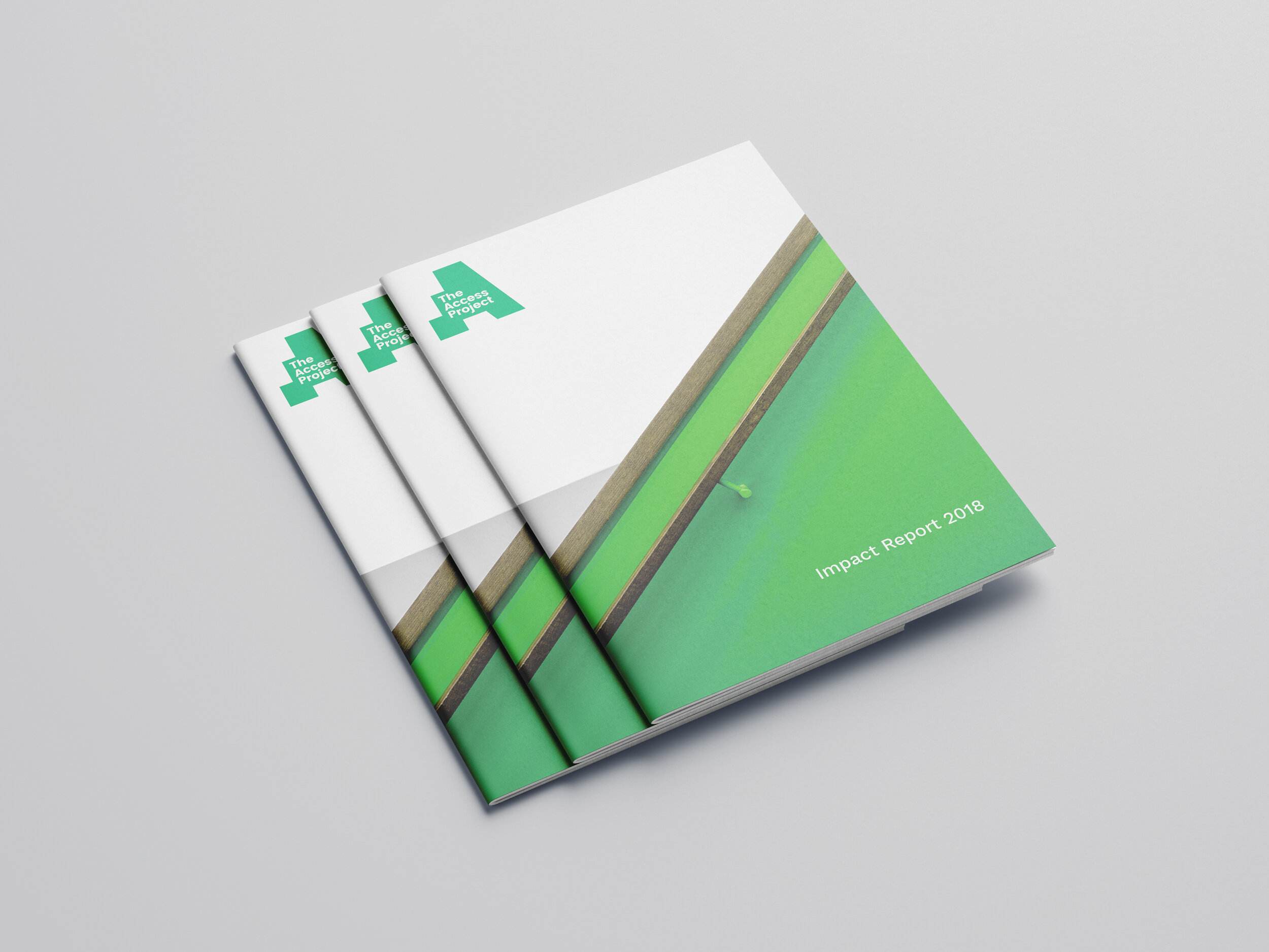
The stepped logo reflects the ideas of attainment, opportunity and progress. A strong symbol that at once identifies the organisation and communicates a sense of what they do.
This was all underpinned by a refreshingly assertive attitude, summed up as ‘Bright young minds on a mission’.
It’s a statement that captures the youthful spirit of the organisation. It includes everyone – students, staff and allows tutors to see themselves as part of the solution. It reflects an overwhelmingly positive attitude and purpose – to see that every child in the UK should have an equal opportunity to achieve their academic ambitions.